Back
Analytics & BI Dashboards

Gantt Chart in Power BI

Author
Pfactorial
June 21, 2024
Share
gantt
In scenarios where understanding the time required for each task in a project's sequential workflow is crucial, Gantt charts emerge as the preferred solution. Gantt chart is a type of bar chart that illustrates a project schedule. It was developed by Henry Gantt in the early 20th century and is still one of the most widely used project management tools today.

Gantt charts can also be used to show task dependencies. A task dependency is a relationship between two tasks where one task cannot start until the other task is finished. Task dependencies are shown on Gantt charts by drawing arrows between the task bar
A Gantt chart typically has two axes:
● The vertical axis lists the tasks that need to be completed.
● The horizontal axis shows the timeline for the project.

Each task is represented by a horizontal bar on the chart. The length of the bar shows the duration of the task. The start and end dates of the task are marked on the bar.

Gantt charts can also be used to show task dependencies. A task dependency is a relationship between two tasks where one task cannot start until the other task is finished. Task dependencies are shown on Gantt charts by drawing arrows between the task bars.
Use Cases Example
Software development: Gantt charts are commonly used in software development to track the progress of projects. They can be used to visualise the different phases of a project, such as planning, design, development, testing, and deployment. It can also be used to identify and resolve dependencies between tasks.

Example: Consider the development of a new web application. Using a Gantt chart, the development team can visualise the entire project lifecycle, from initial requirements gathering to final deployment. Each task, such as front-end development, back-end development, and database integration, is represented by a horizontal bar on the chart. The length of the bar indicates the task duration, while its position on the timeline reflects the start and end dates. By analysing the Gantt chart, the team can identify task dependencies, ensuring that tasks are completed in the correct order. For instance, back-end development cannot begin until the front-end design is finalised. Gantt charts also allow the team to monitor project progress and identify potential delays, enabling them to take corrective actions promptly.

Marketing: Gantt charts can be used in marketing to plan and execute marketing campaigns. They can be used to visualise the different stages of a campaign, such as planning, creative development, media buying, and launch. Gantt charts can also be used to identify and resolve dependencies between tasks.

Example: Consider the launch of a new product. Using a Gantt chart, the marketing team can visualise the entire campaign timeline, from initial concept development to final product launch. Each campaign element, such as social media promotion, email marketing, and influencer partnerships, is represented by a horizontal bar on the chart. The length of the bar indicates the duration of each element, while its position on the timeline reflects the start and end dates. By analysing the Gantt chart, the team can identify any scheduling conflicts or overlaps, ensuring that each campaign element is executed without interference. Gantt charts also allow the team to monitor campaign progress and identify potential delays, enabling them to make adjustments as needed.

Project management: Gantt charts are a versatile tool that can be used to manage a variety of projects. They are particularly useful for projects that have multiple tasks, dependencies, and deadlines.

Example: Consider the construction of a new office building. Using a Gantt chart, the project manager can visualise the entire construction process, from site preparation to final completion. Each construction phase, such as foundation work, framing, roofing, and interior finishes, is represented by a horizontal bar on the chart. The length of the bar indicates the duration of each phase, while its position on the timeline reflects the start and end dates. By analysing the Gantt chart, the project manager can identify any scheduling conflicts or delays in material deliveries, enabling them to take corrective actions promptly. Gantt charts also allow the project manager to monitor project progress, track costs, and communicate updates to stakeholders effectively.
Create Gantt graph in Power BI
One popular method is to use a bar chart visual and create a custom axis for the start and end dates of each task. You can use the DAX (Data Analysis Expressions) language to calculate the duration of each task and the start and end dates. Another method is to use a matrix visual and create a custom measure that calculates the duration of each task and the start and end dates. You can then use the matrix visualization to display the tasks and their corresponding timelines, similar to a Gantt chart.

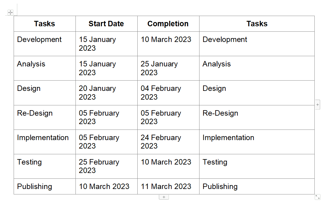
For this we are using a simple data set
gantt table

Here we are gonna discuss the step by step process in converting a Stacked-bar graph into a gantt graph

1. First we need to create a master date table so that we can use it for the filters.
For that we create a table with the Calendar fun with the minimum  from the Start Date and maxim  from Completion .
dimdate = CALENDAR(MIN(t[Start Date]),MAX(t[Completion]))

2.Now we are creating a measure  for date difference from Start Date and Completion using the DATEDIFF
Days Needed = DATEDIFF(t[Start Date],t[Completion],DAY)

3. Now created a bar graph with task and day needed
Bar gantt

4.We created the measure to calculate the minimum start date across all rows in a table, regardless of any filters that may be applied to the table.
OverallStartDate = CALCULATE(MIN(t[Start Date]) , REMOVEFILTERS())

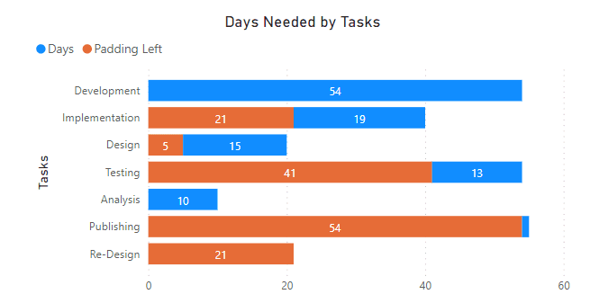
5.Now we create a measure used to calculate the padding left for a date column.
The Padding Left measure dynamically calculates the padding required for each task based on its start date and the overall minimum start date across all tasks. This ensures that tasks are positioned correctly on the timeline without overlapping, creating a clear and visually appealing Gantt chart.

6. Now we can created the Gantt graph by  placing the Padding left into the bar graph created
Filled Gantt
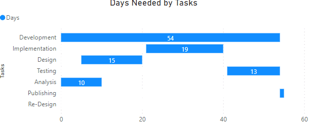
7. Changing the colour of padding left  into white
Gantt bar
Matrix Visual Method
Here we are gonna discuss the step by step process in converting a Matrix-visual graph into a gantt graph
1. First we need to create a master date table so that we can use it for the filters.
For that we create a table with the Calendar  fun with the minimum  from the Start Date and maxim  from Completion
2. Now we are creating a measure  for date difference from Start Date and Completion using the DATEDIFF
3. Now created a matrix graph with task and day needed
Matrix empty
4. Now creating a measure for CFGantt.
The CF Gantt measure dynamically evaluates whether the current date falls within the start and end dates of a task. This information is then used to create a visual representation of the tasks on the Gantt chart. By assigning a value of 1 for dates within the task period, the measure creates a visual representation of the task duration on the timeline.
5. After that we can place the CF Gantt as the value into the create matrix we get the following Matrix

Table gantt

6. Change the format in a manner that we can only see the colour for the 1 in the above matrix and rest all is hidden
Gantt value matrix

7. The final graph created


Final gantt

Benefits of each method for creating Gantt charts in Power BI:
Bar Graph Method

Simpler to implement: The bar graph method is generally easier to implement and understand, as it relies on familiar bar chart visualisations and DAX expressions.

Clearer visual representation: Bar graphs provide a clear visual representation of task durations and timelines, making it easier to identify task dependencies and potential bottlenecks.

Suitable for simple projects: For straightforward projects with a limited number of tasks, the bar graph method offers a quick and effective way to create Gantt charts.

Matrix Method

Greater flexibility: The matrix method offers more flexibility in customising the appearance and formatting of the Gantt chart, allowing for more detailed visualisations.

Suitable for complex projects: For complex projects with multiple tasks, dependencies, and conditional formatting requirements, the matrix method provides a more versatile approach.

Potential for interactive elements: The matrix method can be used to create interactive Gantt charts, allowing users to filter, drill down, and explore task details.

Ultimately, the choice of method depends on the specific needs and preferences of the project manager or data analyst. For simpler projects, the bar graph method offers ease of use and clear visualization. For complex projects or those requiring more customization, the matrix method provides greater flexibility and interactivity.
Conclusion
Gantt charts have long been a cornerstone tool in project management, offering a clear and concise visual representation of project timelines, tasks, and dependencies.
The two methods discussed in this blog, utilising bar graphs and matrices, demonstrate that Gantt charts can be seamlessly integrated into Power BI. The bar graph method offers a straightforward approach, while the matrix method provides flexibility in customising the chart's appearance
DISCOVER MORE. CONNECT WITH US!

Intrigued by what you have read? Dive deeper and stay ahead with the latest insights and trends. We are here to answer your questions and help you explore further.