Back
June 26, 2024
Analytics & BI Dashboards
Data Storytelling : How to tell a great story with Data
Pfactorial
Share

In an era where data is new oil, the skill of simplifying complex information is revolutionary. Data storytelling, the art of transforming intricate data into captivating narratives, holds immense potential for decision-makers, analysts, and communicators.
While many dashboards serve as mere repositories of charts and figures, the true power of data storytelling lies in its ability to captivate, inform, and inspire. In this blog post, we'll show you how to unlock the potential of Power BI, creating data storytelling dashboards. We help you tell meaningful data stories with visuals and insights.
General Practices for Data Storytelling Dashboards
How you create a data storytelling dashboard depends on who will use it and what it's for. Still, there are some basic practices to follow:
- Focus on a single story. Effective dashboards revolve around a central story or message. This ensures that your audience remains focused and engaged. Rather than attempting to cram copious amounts of information into one dashboard, concentrate on delivering a concise and coherent story through a limited set of visuals.
- Use visuals wisely. Visuals are powerful for showing data, but it's important to use them wisely. Don't show too many at once; choose visuals that fit your data and story, and use them to highlight important trends and insights
- Tell a story with your data. The dashboards don't just present data; they tell a story with it. Use visuals and text to explain your data and help your audience understand its significance. Think about what you want your audience to learn from your dashboard, and use your visuals and text to guide them through that learning process.
- Make it interactive. Interactive dashboards allow users to explore the data in more depth and discover their own insights. This can be a valuable way to engage your audience and help them to better understand your story. Consider adding interactive elements to your dashboard, such as filters, slicers, and drill-down capabilities.
Transformative Tactics: Converting Dashboards into Data Narratives
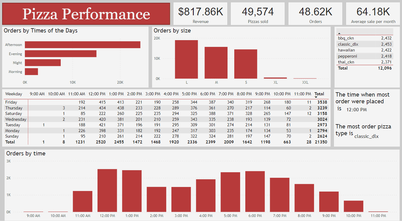
The dashboard shown in the image below is an example of a Dashboard implemented by power bi. We are gonna make change to this dashboard so that we will be able to convert this into a Dashboard that tell its own story

This Dashboard is used for a yearly sale analysis for a pizza shop. Our aim is to make this dashboard such that it can tell its story to understand the performance of the shop.
Steps to convert this Dashboard into storytelling dashboard :
Step 1: Set Your Objective - The initial stage involves defining the primary goal for your dashboard. In this case, the dashboard's focus is on Pizza Performance.
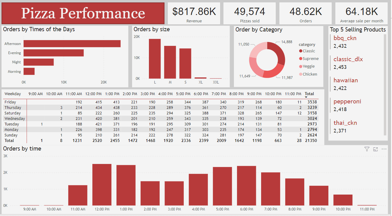
Step 2: Visual Selection -Choose appropriate data visualisations that effectively communicate your insights. Common options include bar charts, line charts, pie charts, maps, and tables.Ensure that your chosen visuals align with your storytelling objectives.

We've updated the dashboard layout and added/removed visuals to improve the flow of the story.
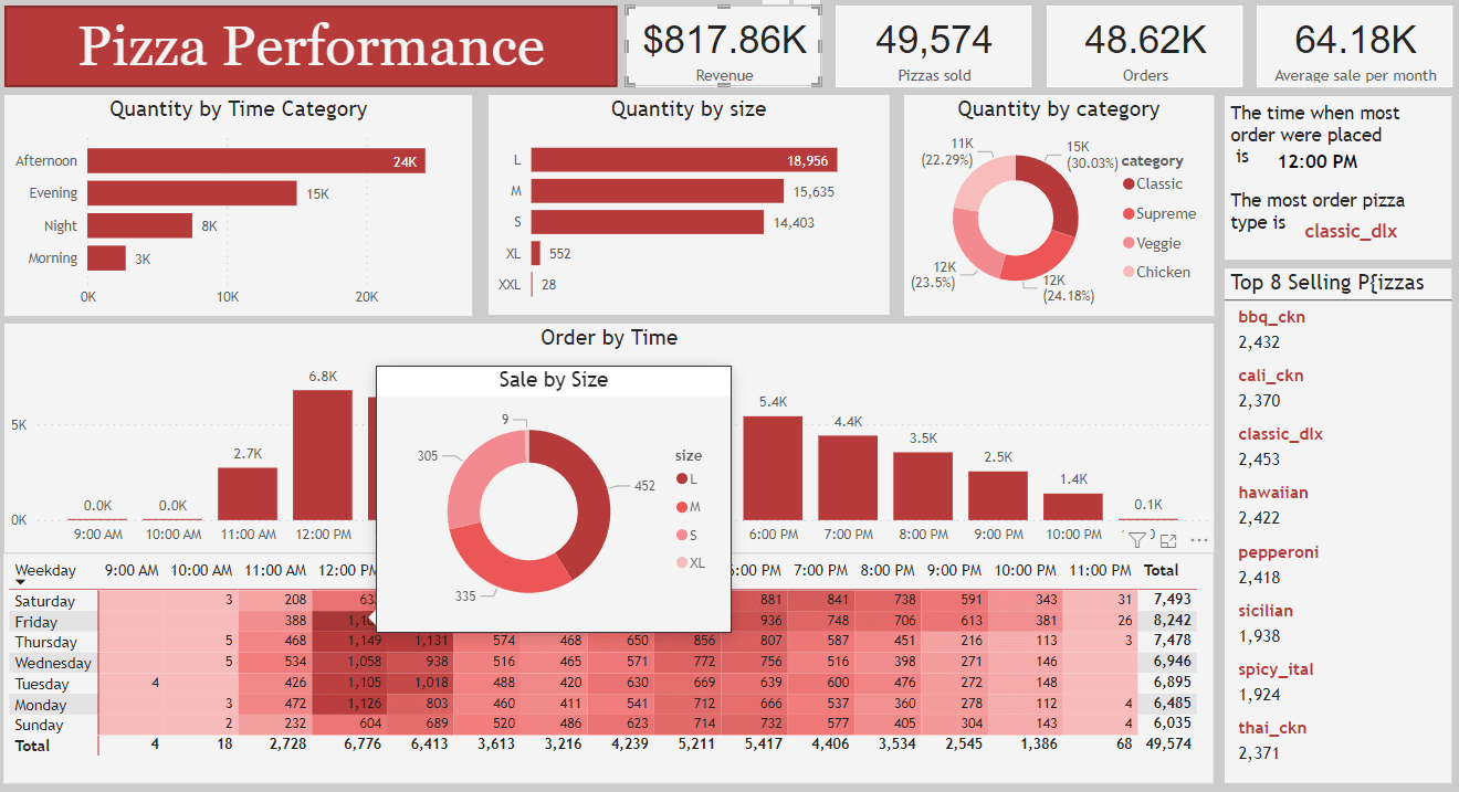
Step 3: Enhance with Narrative and Interactivity-Create clear titles, subtitles, and descriptions for each visualization. Use annotations to highlight key data points. Provide context and explanations with text boxes. Incorporate filters for user exploration.

Step 4: Establish a Logical Flow -Organise the dashboard in a logical order that leads the viewer through the narrative. Ensure a smooth flow that transitions the audience from one insight to the next seamlessly.

Step 5: Elevate Engagement and Continuity-Enhance user interaction with features like buttons and tooltips for a dynamic experience. Craft a narrative within your dashboard, guiding from an introduction through visuals while using visual cues to focus attention. Ensure ongoing relevance by regularly updating with fresh data or evolving insight

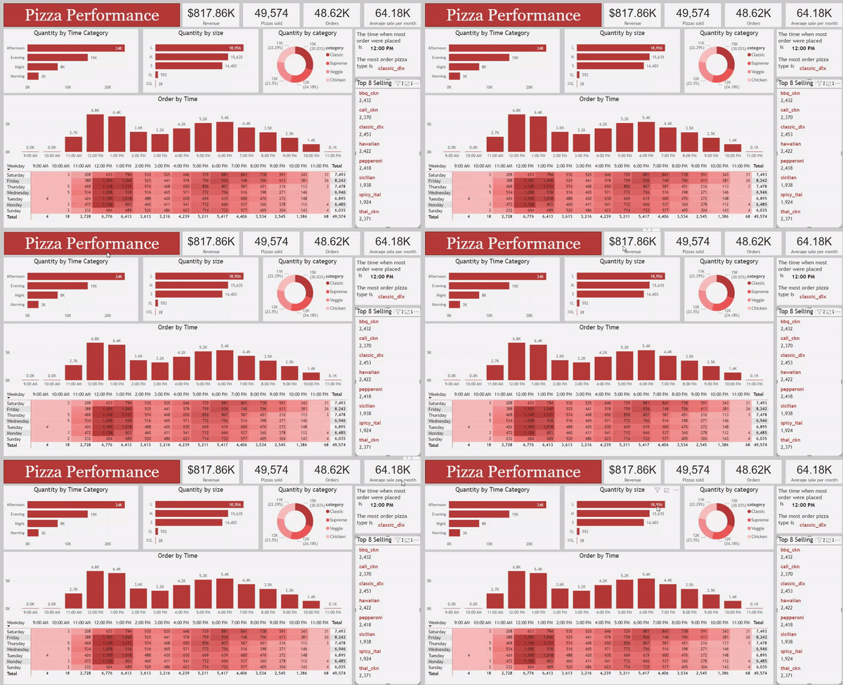
The resulting storytelling dashboard is displayed in the GIF below, highlighting the transformation from our initial dashboard to its current form.

Remember that a great data storytelling dashboard is not just about displaying data; it's about using data to communicate a compelling narrative that drives informed decisions. Keep your audience in mind and focus on delivering actionable insights that resonate with them.Remember that a great data storytelling dashboard is not just about displaying data; it's about using data to communicate a compelling narrative that drives informed decisions. Keep your audience in mind and focus on delivering actionable insights that resonate with them.