Back
June 26, 2024
Analytics & BI Dashboards
Unleash the Power of Your Data: A Guide to Interactive Dashboards and Animated Visuals
Pfactorial
Share

Have you ever found yourself faced with an overwhelming spreadsheet, uncertain of where to start? Well, many of us can relate. As data professionals, the importance for precise data interpretation is clear. Yet, the sheer volume of data can be troubling. This is where data visualization works its magic.
Data visualization, at its core, is the magic of turning data into captivating visuals. It's your guiding torch through the maze of data complexity, unraveling intricate datasets with ease. It's not just about conveying information; it's about doing so intuitively, sparking engagement, and, above all, making complex data effortlessly graspable. In this blog we are going to speak about Animated and Interactive visualization.
So why is interactive dashboard so relevant in data visualization?
Interactive visualizations are like magic spells cast with data visualization tools. They empower you to not just passively read charts and graphs but actively explore and shape them as you desire.
Imagine a world where data is not a one-way street but an open invitation to engage, question, and discover. Interactive data visualization puts you in the driver's seat, offering real-time tools to peel back layers, uncover hidden details, and unearth fresh insights. It's like squeezing every drop of juice from the data fruit, turning information into a vibrant adventure!

Interactive dashboards offer a number of benefits over non-interactive dashboards, including:
● Enhanced Control: Interactive dashboards empower users to dive deep into data, apply filters, and explore information from various angles. This flexibility grants users more control over their data analysis, adapting it to their unique needs.
● Uncovering Hidden Patterns: Interactive dashboards unlock the potential for users to unearth previously unseen insights and detect patterns that static visualizations might conceal. This depth of exploration can lead to valuable discoveries within the data.
● Informed Decision-Making: Interactive dashboards provide users with a deeper understanding of their data, equipping them to make well-informed decisions. By offering a comprehensive view of information, these dashboards enhance the decision-making process.
● Engaging User Experience: Interactive dashboards go beyond passive data consumption; they actively involve users in the data exploration process. This interactivity fosters higher user engagement, leading to increased adoption rates and more valuable insights.
Now let's dive into some concrete examples that shows the practical applications of interactive dashboards across various domains:
Use Case 1: Business Management
In the realm of business, interactive dashboards empower organizations to track sales, revenue, and financial metrics with precision. They serve as digital command centers, providing real-time insights that steer strategic planning, enhance resource allocation, and drive overall efficiency.
Use Case 2: Healthcare Optimization
Within the healthcare sector, interactive dashboards are catalysts for improved patient care and public health management. They help healthcare professionals manage patient data, monitor disease outbreaks, and optimize resource allocation, ultimately leading to more effective healthcare delivery.
Use Case 3: Marketing Insights
In the dynamic world of marketing and digital analytics, interactive dashboards revolutionize how marketers approach campaigns. These tools enable the analysis of campaign performance, website traffic, and customer behavior, shaping marketing strategies that yield better ROI and customer engagement.
Animated visuals in data visualization
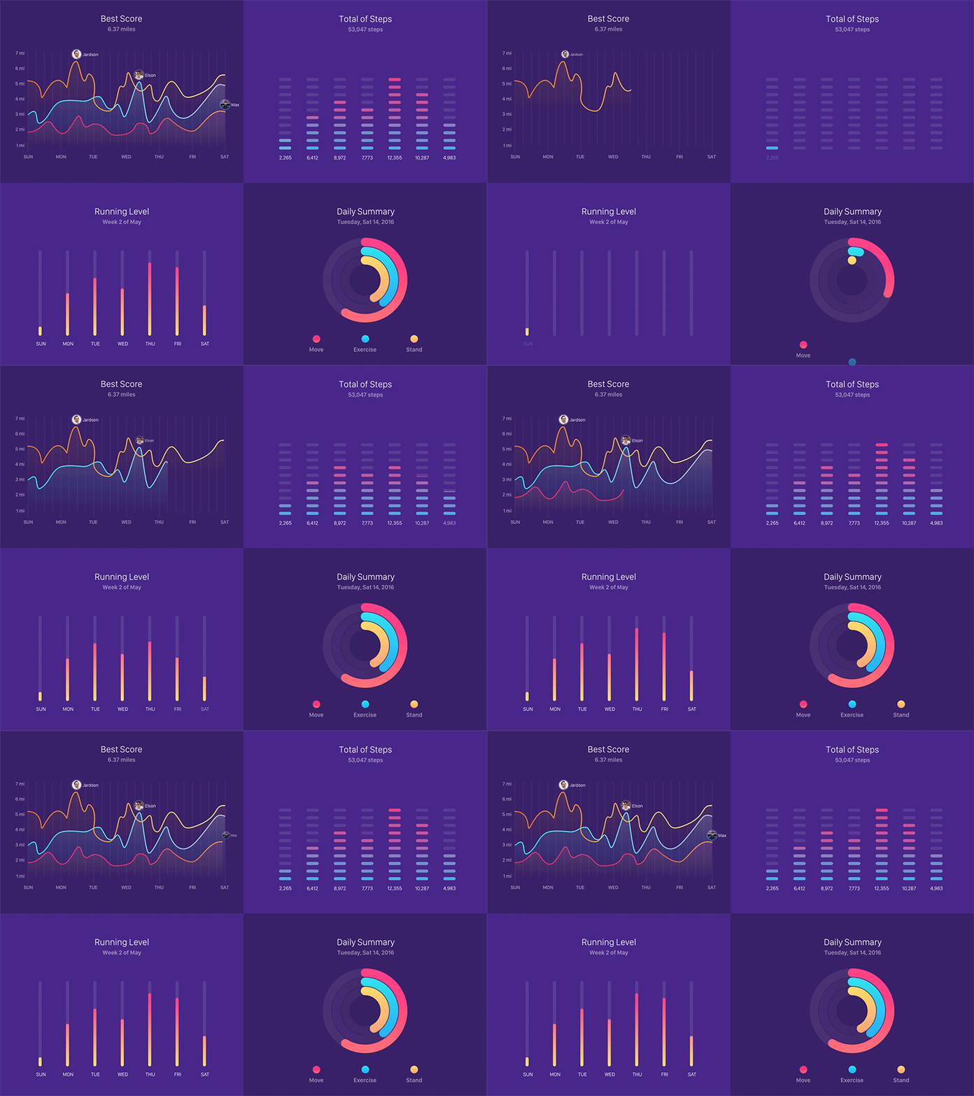
Animated visuals serve as powerful tools for data storytelling. They have the capacity to transform static data into dynamic narratives, unveiling insights and patterns that might otherwise remain hidden. Animated visuals are particularly effective when it comes to illustrating time-based sequences and logically ordered data series. Below is an example that demonstrates how population dynamics have evolved over time.

While animated presentations may take a bit more time to unfold, they wield the power of engagement, drawing in audiences who might not typically find data thrilling. They breathe life into the world of data visualization, making it not only accessible but also utterly captivating.
Here are some additional tips for using animated visuals effectively:
● Choose the right animation type. There are many different types of animations, each with its own strengths and weaknesses. For example, bar charts are well-suited for animating changes over time, while pie charts can be used to highlight changes in composition.
● Use animation to tell a story. Think about what you want to communicate with your animation and choose the type and speed of animation that will best support your message.
Animated visuals can be used to enhance data visualization and make it more engaging and informative. Here are a few examples of how animated visuals can be used to track COVID-19 cases:

● Tracking cases over time: An animated Pie chart can be used to show how the number of COVID-19 cases has changed over time with also show the number of people recovered and death over time
● Comparing different countries: An animated bar chart can be used to compare the number of COVID-19 cases in different countries or regions. This can help to identify which countries or regions are most affected by the pandemic, and how their case numbers compare to each other over time.
Depicts there are many challenge while creating this animated visuals
● Time and complexity: Animated visuals can be time-consuming and complex to create, especially if they are complex or involve large datasets. This can be a challenge for teams with limited resources or time constraints.
● Clarity: Animated visuals can be visually complex, making it difficult for users to understand what they are seeing. It is important to use animation sparingly and to design animated visuals carefully, so that users can easily follow the story and understand the key insights.
● Performance: Animated visuals can impact the performance of web pages and other applications. It is important to optimize animated visuals for performance, so that they do not slow down the user experience
Despite these hurdles, animated visuals stand as a formidable asset in data visualization. Animated visuals are a versatile tool that can be used to enhance data visualization and make it more engaging and informative. By following the best practices outlined above, you can create animated visuals that will help you to communicate your data story effective