Back
Analytics & BI Dashboards

Data Visualization Tools

Author
pfactorial
July 01, 2024
Share
Best Data Visualization Tools
In today's data-driven world, businesses of all sizes are awash in a sea of information. Extracting meaningful insights from this vast ocean can be a daunting task, especially without the right tools. This is where data visualization tools emerge as indispensable allies, transforming complex data into clear and comprehensible visual representations that empower businesses to make informed decisions.

Data visualization is the art of translating raw data into insightful graphics, making it easier to identify patterns, trends, and outliers that would otherwise remain hidden within the depths of spreadsheets and databases. These visual representations serve as a bridge between data and understanding, enabling businesses to navigate the complexities of their data with clarity and confidence.
Step Involved in data visualisation
Before embarking on the journey of data visualization, it's crucial to establish a clear roadmap. Here are the essential steps involved in creating effective data visualisations:
  1.  Define your goal and audience. What do you want to communicate with your visualization? Who is your audience? Understanding your goals and audience will help you choose the right type of visualization and design elements
  2. Gather and clean your data. Make sure your data is accurate, complete, and consistent. This may involve removing duplicates, correcting errors, and formatting data correctly.
  3. Explore your data. Get to know your data by summarising it, calculating statistics, and looking for patterns. This will help you choose the right visualization for your data.
  4. Choose a visualization type. There are many different types of visualisations, such as bar charts, line charts, pie charts, maps, and scatter plots. Each type of visualization is better suited for different types of data and different goals.
  5. Design your visualization. Choose a colour scheme, fonts, and other design elements that will make your visualization clear, attractive, and easy to understand.
  6. Refine and iterate. Get feedback on your visualization from others and make changes as needed. Continue to refine your visualization until it effectively communicates your message.
Visualization tools
The landscape of data visualization tools is brimming with options, each offering unique strengths and capabilities. Here are a few of the most popular tools that empower businesses to transform data into insights:
Visualization tools

Power BI

Power BI stands as a stalwart in the data visualization arena, offering a comprehensive suite of features for businesses of all sizes. Its drag-and-drop interface simplifies data exploration and visualization, enabling users to create interactive dashboards and reports with ease. Power BI seamlessly integrates with Microsoft's ecosystem, making it a popular choice for organisations already utilising Microsoft products.
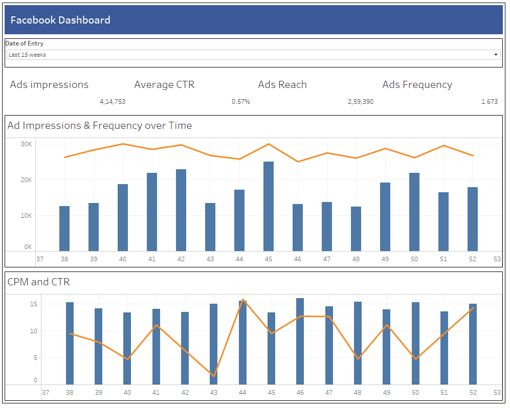
Power BI dashboard

Tableau

Tableau is renowned for its exceptional ease of use and its ability to craft visually captivating stories from data. Its intuitive interface allows users to create stunning visualisations with minimal effort, effectively communicating insights to a wide audience. Tableau's storytelling capabilities make it an ideal tool for businesses seeking to engage their teams and stakeholders with data-driven narratives.
Tableau Dashboard

Klipfolio

Klipfolio excels in simplifying the tracking and monitoring of key performance indicators (KPIs). Its drag-and-drop interface facilitates the creation of interactive dashboards that keep KPIs at the forefront, enabling businesses to stay on top of their performance metrics. Klipfolio's real-time data updates ensure that users always have access to the latest information, making it an invaluable tool for data-driven decision-making.
Klipfolio dashboard

Google Data Studio

Google Data Studio stands out as a free cloud-based data visualization tool, making it an accessible option for businesses of all sizes. Its user-friendly interface and wide range of pre-built templates allow users to create informative visualisations without extensive technical expertise. Google Data Studio's integration with Google Analytics and Google Sheets makes it a convenient choice for businesses already utilising these Google products.
Data studio dashboard

Google Looker Studio

Google Looker Studio is a cloud-based data visualization tool specifically designed for enterprises. Its advanced features and integration with Google Cloud Platform (GCP) make it an ideal solution for businesses with complex data needs. Google Looker Studio's data exploration and analysis capabilities empower enterprises to uncover hidden patterns and trends, driving informed decision-making at scale. (link)
Looker dashboard

Conclusion
Data visualization tools are essential for businesses that want to use their data to make smart decisions. There are many different tools available, each with its own strengths and weaknesses. Businesses can find the right tool for them to turn their data into useful information. By using data visualization, businesses can improve their operations, make customers happier, and come up with new ideas.
DISCOVER MORE. CONNECT WITH US!

Intrigued by what you have read? Dive deeper and stay ahead with the latest insights and trends. We are here to answer your questions and help you explore further.